Do You Suffer From Indecision in the Wine Aisle?
I would describe my understanding of wine as ‘Johnny Average’. I know nothing about vintages, I could not tell you the difference between a Malbec and a Shiraz in its taste, or where most grapes are grown, except Champagne, and yet I know enough. Enough to know what I like. Enough to order from a wine menu without looking like Derek Trotter and enough to enjoy wine.
But the supermarkets, their suppliers, the category manager and the buyers don’t make it very easy for us Johnny Averages. And despite the progress of technology and Category Management, the wine aisle still looks like a place I ought to enjoy. Yet, there are so many signals I am paralysed to know what to do every time I stand in it.
Some Shop Categories are Much Easier to Shop?
In 1994 Efficient Consumer Response (ECR) was given birth in Europe. A body set-up to help FMCG companies, like supermarkets and their suppliers, to remove costs in the supply chain by collaborating better together whilst keeping the consumer in mind. Hot on ECR’s heels was the announcement of the answer to all supermarkets and suppliers’ prayers – ‘Category Management’. Whilst it never quite answered everyone’s prayers Category Management did encourage, and for some, force, people in our industry to start thinking less about what can be made and more about what the customer wanted.
Two of the keys to the effective Category Management vault were category segmentation and consumer decision tree. The latter, I prefer to call the ‘Shopper Map’. In essence, the easier you could make it for your shopper to shop the more they would buy. For example, and almost laughable now, were ready meals. Originally displayed on the supermarket shelves by size, ‘meals for one’, ‘meals for two’, etc.
Then, some bright spark asked the shopper how they bought ready meals. They cited their reference as the various takeaway menus they kept in the messy drawer. Shop by cuisine was the answer. And still today the first decision the shopper makes, and it matches the first decision the shopper wants to make, is ‘Indian, Chinese or…?

Introducing the Shopper Map
The shopper map is about those decisions that you make as a shopper standing in front of the category in-store. A great category manager knows the choices you make before you enter the store and those you make at the fixture. Shown as a flowchart, each option is mapped by the category manager and kept as one of the pages of their bible. Buying-in the other members of the team that are less concerned by exactly what the shopper does and more with the ‘How can we sell more?’, the shopper map is shared as the top 3 questions that a shopper asks:
- ‘What do I need this for?’
- ‘What do I like?’
- ‘How fresh does this look?’
By understanding this shopper map the category segmentation then follows accordingly by not displaying the fixture by price because this is not an early decision by the shopper, and instead merchandising the fixture with ‘Side salads’, ‘Party salads’, ‘Salads for 1’, etc.
The closer the segmentation to the questions that the shopper asks themselves, the easier the category is to shop. Moreover, the higher the sales.
Wine Category Problems?
My hunch is that the exclusivity of wine, driven by the mystery of wine, prevents those inside the circle to want to let others in. Like Heston Blumenthal said, on his journey with ‘Little Chef’ putting oysters on the menu, ‘Am I in such a gastronomic bubble that I cannot see what average & typical people want?’. Heston was wise and brave enough to be able to go outside and look back in. Are our wine professionals? The first issue is possibly a lack of wanting to solve the problem. This could reduce the exclusivity and reveal the magic.

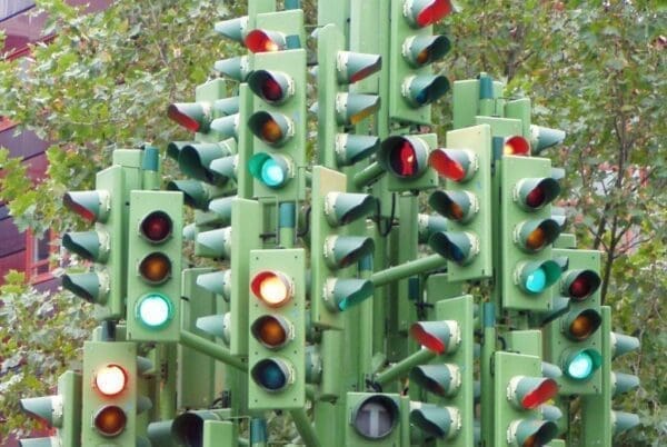
The second issue is that the shopper map is confusing. Like being at a junction with several traffic light trees, supposedly showing you the way – You don’t know where to look first. In the big four UK supermarkets, there are 8 questions being answered in the wine aisle. They are all shouting for their own voice to be heard. The loudest is country. Shouting also clearly is red, wine, rose, sparkling and other. Then the noise gets deafening with region, e.g. Bordeaux, brand, e.g. Hardy’s, Gallo, etc., format, e.g. bottle, box, or other, grape, e.g. Pinot, tier, e.g. Finest, and then add to this the supermarkets making some recent attempts to make the category accessible with type ‘Rich and Complex, or ‘Smooth and Mellow, with each supermarket creating their own version with their own colours.
Sticky Learning ® is 7 times more effective than 1-day training courses. Plus, you will get a Chain of Evidence proving your Return on Investment. Discover soft skills training that changes behaviours long term.

Too Much Noise in the Wine Category
Most categories can deal with a number of questions being asked and segmenting the category accordingly. Take a complex category, add mystery, add exclusivity, add 8 signposts without a priority of order and chaos ensues. The litmus test is how much the shopper buys on offer. I suspect that it is higher in the wine category than in other categories because of the noise. It is much easier to grab a perceived good deal from the end of the aisle without having to venture down the aisle. Almost escaping without having to run the gauntlet!
Improve the Wine Category?
It is good to see that some supermarkets are attempting to make the wine category more accessible. Morrison’s have tried a new approach by taste profiling 1,000 wines on their website, which uses technology to solve the problem, but this still doesn’t solve the problem in-store.

Using shopper language like ‘Rich and Complex’ (Sainsbury’s) makes an attempt to make the wine aisle more accessible. Yet, the result is to add a further, nicer looking traffic light, competing with the other 7 traffic lights telling us also what to do.
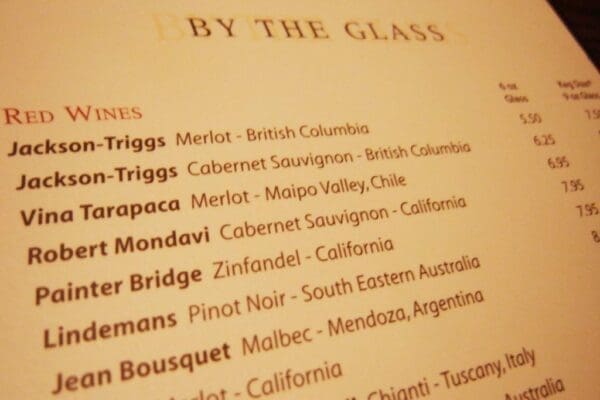
Take any wine menu. In fact Google ‘wine menu’, like the one above. I guarantee that for 9 out of 10 wine menus you’ll see the first shopper decision shown ‘Red, white or rose’. Then the second shopper decision is shown, grape variety, e.g. Merlot, and then the third shopper decision is shown – Country. Maybe our wine professionals are not hearing shoppers tell us that they are using wine menus as a reference point. Like ready meal shoppers did with takeaway menus before them. Maybe the shoppers aren’t, but it seems better to guide them with what they know than reinvent the wheel.
As a Category Manager would say, ‘If the category assortment matches the consumer decision tree, ease of shopping is high’. Or put another way, ‘If the shopper can shop how they want to shop, they’ll shop more’.
Let’s help them shop, instead of making the supermarket wine category the hardest category to shop.


