This Sales Tip is a Small and Simple Change You Can Make on Your Proposals, and Presentations to Improve Your Sales Through Sales Psychology. Yet, Very Powerful.
The sales tip comes from Nick Kolenda. A research nerd who studies perception and behaviour. He distils complex research into a unique style that is clear, concise, and funny. And his studies into human behaviour are a real eye-opener.
If you are sharing information with a client in a presentation or pitching with a proposal, Nick’s sales tip is to group your logo’s together. Therefore, Nick says, ‘Most prospects, customers and clients, will receive proposals from multiple sources. Ultimately, they will make their decision by imagining themselves working with each business.
And these mental images help determine which business “feels right.” Therefore, you can nudge prospects to choose your business by easing their ability to imagine working with you.’
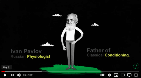
This is similar to classical conditioning. Remember the ‘Pavlov’ experiment?
The experiment was with dogs that were conditioned to associate a bell with food. Pairing the logos’ will strengthen the link between your business and their business. Also, creating a visual partnership will help them to imagine a conceptual partnership. The prospect will imagine working with you more easily. Then, as Nick says, ‘After numerous exposures…they will misattribute this vividness with a desire.’.
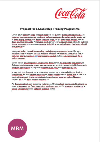
Visualising Us Not Working Together
In this word file, you can see that the logos are apart. According to Nick, it makes it harder for the prospect to visualise us working together:
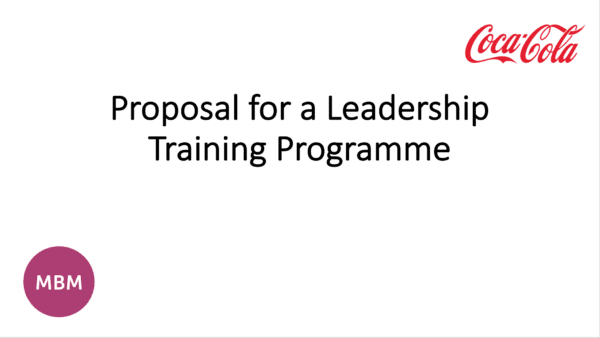
In this Powerpoint file, you can also see that the logos are apart. According to Nick it makes it harder for the prospect to visualise us working together:
Visualising Us Working Together
In this word file, you can see that the logos are together which helps the prospect to visualise us working together:
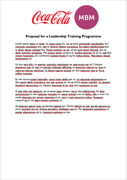
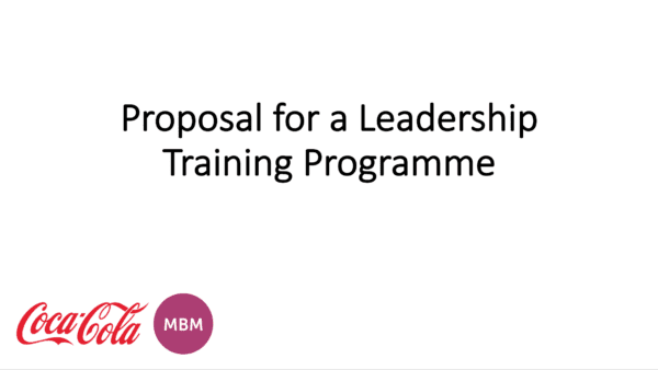
In this Powerpoint file, you can also see that the logos are together. Visualisation sales tip achieved:
Summarising This Sales Tip
I asked Nick whether adding a ‘+’ symbol is useful. He replied, ‘I think it’s helpful. The important criterion is that viewers group these two businesses via a “gestalt” mechanism. So, you might be able to achieve the same effect by placing these business names inside a rectangle or something, but I think the plus sign nudges the viewer to mentally group them.’.
Thank you, Nick. Great advice. Nick offers more resources.
