Why bother with a Pen Portrait? Most businesses don’t. Businesses should bother because the Customer is the end game and knowing who they are, is critical to giving them what they want.
Let’s begin with the first question ‘What is a Pen Portrait’?
In this article, we’ll be talking about shoppers because our background is in grocery and we think of customers as the ones who push the trolley. I don’t believe in one format of pen portrait. Any format works as long as it achieves the objective. The objective of a pen portrait is:
To significantly improve your understanding of your customer for everyone in the business, so that everyone in the business can make better decisions every day that increase their customers’ satisfaction, so that you sell more.”
That’s it. That’s the whole ball game. Knowing the customer better so that you can do things better for them, and in turn, so that your business does better. Most businesses shy away from a pen portrait because it’s always on the ‘one day maybe’ pile. They could probably do it but it’s hard and the value it brings is intangible. I’d like to raise the flag for how useful they can be, how you can do one fairly easily and what an effective one looks like.

A Checklist to Help You Know if You Have Created a Useful Pen Portrait
- Updated easily and quickly (Doesn’t need to be sent off to a graphic designer that will take 2 weeks to do it).
- Significantly improves the understanding of the shopper for everyone who makes decisions that affect the shopper. As a must, it should include WOP FOP PEN; Weight of purchase – how much they buy each time, Frequency of purchase – how often they buy, and penetration – how many shoppers buy into this category.
“Understanding the Shopper is Key.”

- Enables people in your organisation to make more informed decisions on a day-to-day basis that can impact the shopper positively.
- Covers all 4 colours of the HBDI model;
- Facts – Includes facts about the shopper’s behaviours, e.g. They buy 6 times per year.
- Form – Shows when the pen portrait will be updated, by whom, and who can be contacted to find out more.
- Feelings – Shares how the shopper feels about the products/range.
- Future – Challenges what the business needs to do to improve the products.
“The Shopper is Only a Third of the Answer.”
- Written so that everyone understands. For example, ‘FOP’ becomes ‘Frequency of Purchase’ or even ‘They shop 6 times per year’.
- Enables us to relate to the person, the shopper. Maybe giving them a name or making us feel like we know someone like them. If you can include what they watch, what they read, and their social media platforms, it can help you to ‘fish where the fish are’. If your shoppers are part of running clubs then maybe advertising in the jogging club magazine gets your message to your customers.
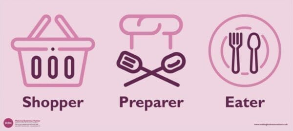
- Includes the shopper, and also the preparer and the eater. All 3 parts of ‘the shopper’.
Sticky Learning ® is 7 times more effective than 1-day training courses. Plus, you will get a Chain of Evidence proving your Return on Investment. Discover soft skills training that changes behaviours long term.

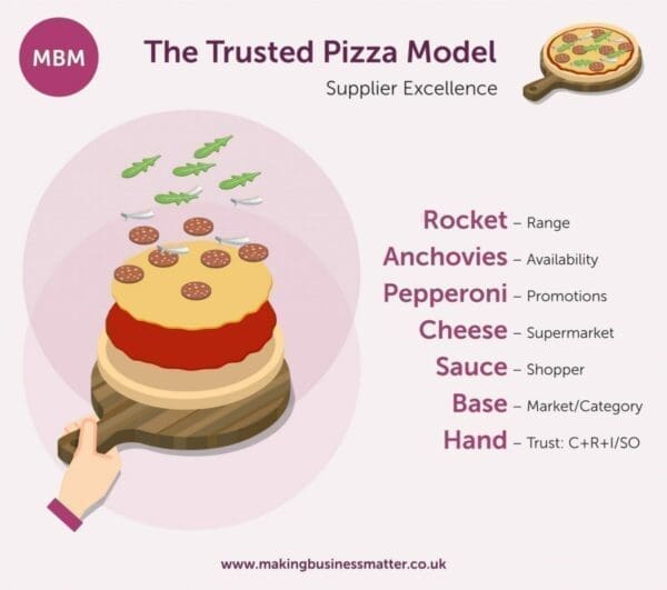
“Remember, the Sauce…”
- You know what to do to increase customer satisfaction and in turn sales, as a result of reading it.
- Easily available. It’s either a screensaver, a desk A5 A-frame, or a handy wallet credit card piece. It is not hard to get at. Don’t discount short YouTube video as a great way to bring the customer to life.
- It shares problems/opportunities that need to be solved in order to improve customer satisfaction.
Use this 10-point checklist to assess whether your pen portrait is fit for purpose.
What Does a Great Pen Portrait Look Like?
Tesco do pen portraits very well. Either because they are continuing to be a market leader in every way, and this is just another example. Or Tesco is just genuinely customer-led, or marketing pushed for the importance of pen portraits. It doesn’t matter. Either way, Tesco has great pen portraits and they are known across the industry for them.
Tesco identified 5 different shoppers; Roshni, The Wicks, The Mayers, Carol and Dawn. You can see all 5 groups of shoppers in this pdf. I suggest you begin with one initial pen portrait and then build more once you are comfortable that you can tick the 10-point checklist above.
Let’s take a look at one of Tesco’s shopper pen portraits…
The Wicks are One of Tesco’s Shoppers
You can see from the image below how they have brought them to life. Click for a larger version:
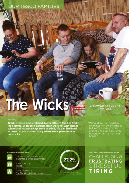
Their pen portrait is a simple one-pager containing:
- The customer’s name, ‘The Wicks’, which brings them to life and the images show who they are so that we can relate to them.
- A simple description to differentiate the 5 groups. The Wicks are ‘Lower Affluent Families.’
- Tesco’s succinct summary brings the Wick family further to life with 43 words: ‘Tired, stressed and stretched, lower affluent families find life a battle. With both parents often working, with kids at school and money always front of mind, life can feel hard at times. Home is a sanctuary where basic pleasures can mean a lot.’ A great description because it is real, describing them as tired, stressed and that home is their safe place.
- Accompanied by 27 words that you feel the people would say, ‘We’ve done our hardship, we’re not rich by any means but we’re a loving family and no one ever goes away hungry or thirsty from our house.’
- Then, we get 3 facts that share their shopping habits, below. Key information that helps you know, for example, if you wanted more of their spend you’d compare your product/range’ frequency to theirs, and ask ‘Why are The Mayers not buying my product every time they shop?’
- Frequency of shop
- Spend per trip
- Store repertoire
- After which we have a graphic which tells us how important they are to Tesco – their spending and how it compares to the average.
- Finally, we end with four words that describe their life best; challenging, frustrating, stressful, and tiring.
Assessing Tesco’s Pen Portrait Versus Our Checklist

- Updated easily and quickly:
- Not applicable as big companies can move on this fast with an in-house team.
- Significantly improves the understanding of the shopper for everyone who makes decisions that affect the shopper:
- My belief is that this does because Tesco had nothing before and this is certainly a good move forward. The 5 groups are now used by Dunnhumby, Kantar, Vyper, etc. so the market has certainly embraced these groups.
- Enables people in your organisation to make more informed decisions on a day-to-day basis that impact the shopper:
- The challenge is whether there is a deeper version for those who want to know more and those who want a specific pen portrait for their category because a buyer might struggle to make decisions with such high-level data.
- Covers all 4 colours of the HBDI model;
- Facts – Includes facts about the shopper’s behaviours, e.g. They buy 6 times per year:
- Included. Tick.
- Form – Shows when the pen portrait will be updated, by whom, and who can be contacted to find out more:
- No, but then Tesco colleagues will probably know where to find out more – their Intranet. Suppliers might be lost though.
- Feelings – Shares how the shopper feels about life, and the products/range.
- Yes. However, I’d like to see something about how they view Tesco.
- Future – Challenges what the business needs to do to improve the products:
- You could infer that you need to make life easier for them, i.e. less stressful, but again it is too high a level to implement.
- Facts – Includes facts about the shopper’s behaviours, e.g. They buy 6 times per year:
Sections 6-10
- Written so that everyone understands. For example, ‘FOP’ becomes ‘Frequency of Purchase’ or even ‘They shop 6 times per year’:
- Simple language is used.
- Enables us to relate to the person, the shopper.
- The photo, naming them, and sharing their quote with the 4 words at the end, does this very well.
- Includes the shopper, and also the preparer and the eater. All 3 parts of ‘the shopper’.
- Not applicable at this level.
- You know what to do to increase sales as a result of reading it.
- Yes. For example, compare your range to the competitors listed.
- Easily available. It’s either a screensaver, a desk A5 A-frame, or a handy wallet credit card piece. It is not hard to get at.
- The pdf seems to be easily available.
- It shares problems/opportunities that need to be solved to improve customer satisfaction.
- They don’t share the opportunities, so it is hard to know what else we need to do to improve customer satisfaction. Apart from general ideas like they are ‘tired/stressed’, a focus on convenience and making it easy is essential.
All in all a good example. A version by category would be very useful to help buyers and suppliers get right to the heart of their customers.
Please read on to find a category pen portrait below…
MBM’s Target ‘Shopper’ – A HR Manager
This is an old version of our very own pen portrait. Please assess this against the 10-point checklist because I think it needs an upgrade! What would you include?
Click the image for a larger version:
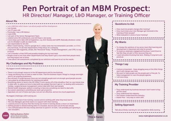
Category Shopper Pen Portrait
Version 1
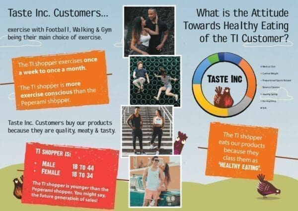
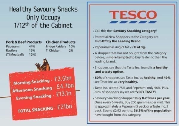
We are working on a Category Management product with a client and one of the briefs was to create a shopper profile. We took the data and briefed a graphic designer. This is the result. The problem is that it doesn’t bring the shopper to life, has too many facts, and is not engaging.
Interestingly one of our discoveries was that men tend not to use Facebook so our social media campaigns had to use YouTube to get our message in front of men.
Click the first image for a larger version:
Version 2

The second revision has learnt the following lessons:
- One pager.
- The customer who they are questioning is shown at the top.
- A quality photo.
- Fewer facts.
- The information is better structured to make it easier to navigate.
However, it still has a way to go to achieve a decent score out of 10 versus the checklist and stands at about 6/10.
Version 3
This is a further build and takes the best of version 2 and tries to achieve 8/10. The next step is to get feedback and test it in the workplace. Over the next month do people start to refer to it?
Click for a larger version:

Just Start and Start Small
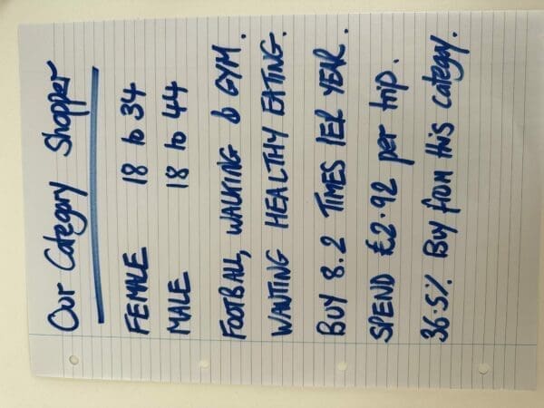
You might be surprised at the inertia in creating a pen portrait because people perceive it as a complex task that requires a lot of effort and they don’t know where to start. However, it isn’t. Follow these 7 steps to begin:
- Grab the category data that you have. It might be quantitive, qualitative or both.
- Analyse the data for key facts that help you to understand the shopper. Aim to identify 7 facts that bring them to life.
- Begin with the shoppers’ gender and age.
- Then, add some information you know about them.
- Include how often they shop, how much they spend, and a further useful fact.
- Write these 7 facts on an A4 page.
- Share with the team and ask what else they want to know to help you bring the shopper to life for them.
It’s Your Time!
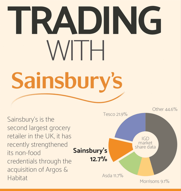
Assess these two infographics from IGD, to see how much you’ve learned!
Click both images for a larger version:

We’re on LinkedIn. Engage with us.

