Achieve Chart Clarity in Today’s World of Category Management
When using charts and graphs to paint a performance picture or to communicate an important point, it is all to easy to confuse the audience, by over complicating and blurring the message by trying to add far too much detail. A simple rule of thumb should be one observation, one insight and one recommendation. This is the difference between chart clarity, not chart disparity.
The below three images and explanations, show how you can clean things up and get your point across with even more chart clarity:
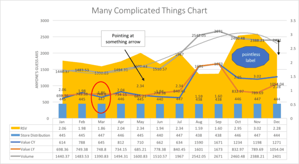
A great example of what bad looks like…
This chart is trying to communicate many things about something. You can see an overly complicated mess of a chart, that the creator has lovingly made and whom is desperate to communicate many things, when you really need only one insight. To much data, data that is too old, plus a host of unnecessary formatting. The audience will get lost almost immediately, no matter how great the explanation is. Let’s remove many of the elements and see how it improves.

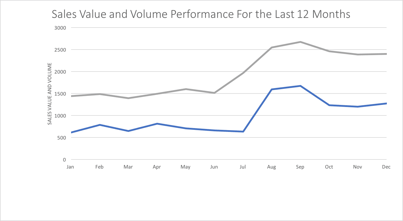
Data, simplified, minus some ‘noise’…
Better, but, what is the key message that needs to be taken away?


>> Information to Insight Coaching Cards <<
>> Buy on Amazon <<
>> Buy on Etsy <<
It is better, many of the unnecessary elements are gone, including the data table (why show the same data twice?). The different chart types have been removed, we no longer have bars, lines and area charts all within the same graph. The title is still an issues, it is basically just telling us what the chart is showing, we can already see that, so it’s a waste.
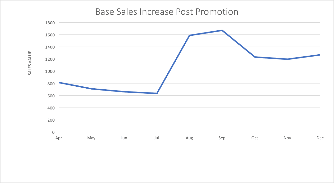
Same data with a much better title…

Bingo! – the audience now gets it. ‘Promotions lead to new customers that continue buying – lets do another promotion’. We now have chart clarity not chart disparity.


