Supermarkets and suppliers know that promotions are a necessary evil. The more informed suppliers and supermarkets know that you can achieve a good return on investment from promotions.
One of the ways to achieve this is by understanding the shopper psychology behind pricing promotions.
In this article, we’ll share with you the shopper science behind why we make the choices we do when we buy promotions. And how to use that science to change your pricing promotions’ decisions to increase your sales and profit.
1. Pricing Promotions – Position Your Price Marking Bottom Left
The science behind positioning your price marks bottom left is based on two axis; ‘bottom to top’ and ‘left to right’.
We conceptualise numbers on a vertical line ‘bottom to top’; small at the bottom and higher at the top. The same is true with numbers on a horizontal line (left to right), with the smaller numbers on the left and the higher numbers on the right. Therefore we believe that a number bottom left must be the smallest.
In the example below the price mark needs to be moved to the left and lower down on the pack. Ideally, to the left of the label.

2. Pricing Promotions – Make the Price Font Size Smaller
You can influence your shopper to perceive the price as ‘smaller’ by reducing the size of the font of the price. This is particularly effective when contrasting it with a larger sized reference price.
This example below shows how NOT to follow this scientific insight into shopper psychology.

3. Pricing Promotions – Change the First Number
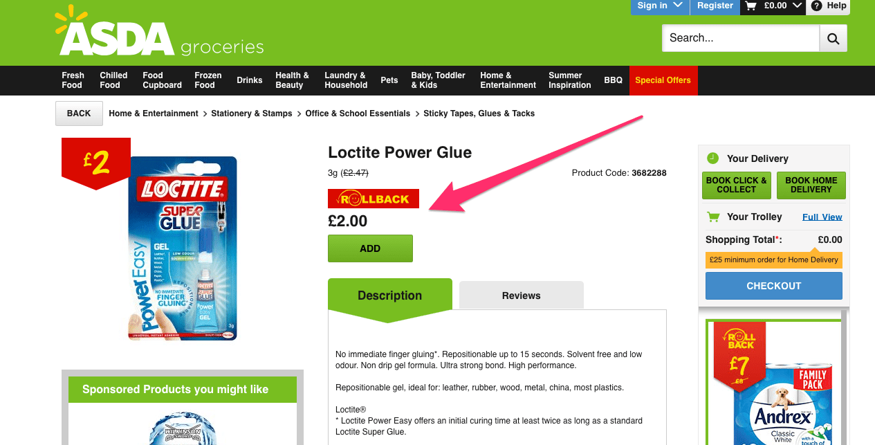
The scientists nickname this ‘charm pricing’. For example, changing £1.89 to £1.88 will make little difference. However changing £2.00 to £1.99 will have a positive effect. The science behind this is that our brains read the first number and anchor the price on that digit. In this case ‘1’, rather than ‘2.
In the example below the ASDA buyer would have had more impact dropping the price to £1.99 (The caveat is round pricing, which can be a corporate guideline, and is discussed in No.5 below).
Sticky Learning ® is 7 times more effective than 1-day training courses. Plus, you will get a Chain of Evidence proving your Return on Investment. Discover soft skills training that changes behaviours long term.

4. Pricing Promotions – Add the Right language Next to the Price
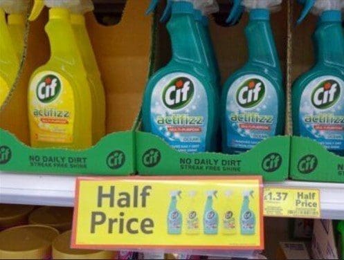
Choosing the language that sits near your price is very important. Research concluded that a price shown with ‘low friction’, and ‘high performance’ were found to impact the shopper’s choice. Words that were congruent with the promotion, e.g. free, low, or reduced, positively influenced the shopper to purchase. Words such as ‘high’ encouraged the shopper not to purchase.
The example below shows the words ‘free’ in the same view as the price. Probably not by design, yet this will still have influenced the shopper to purchase. Using ‘streak free shine’ on the point of sale would have helped further.
5. Pricing Promotions – Using ‘Roundedness’ Accordingly
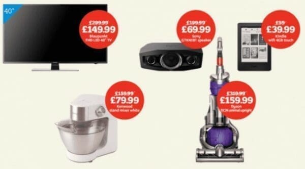
This pricing promotion tactic is a game of two halves. Shoppers find that round prices, e.g. £35 are easier to process. More than £34.99. That said, the research also states the opposite to be true. This is because if you use round numbers the shopper believes that the price has been inflated. The key is that if the purchase is emotional, leave out the pence. For emotional purchases use round prices, e.g. ‘£35’ and for non-emotional purchases use specific prices, e.g. ‘£34.99’. An emotional purchase is an iPad, an expensive piece of steak for dinner or wine. A non-emotional purchase is cling film, shower gel, or a frying pan.
In these examples below the research suggests using whole numbers would work better (Maybe not for the vacuum cleaner, unless you get emotional buying one!).
6. Pricing Promotions – Use Fewer Syllables
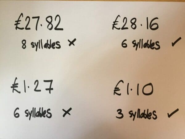
Our brain uses more resources to process prices with more syllables. For example, £27.82 is 8 syllables, whereas £28.16 is only 6 syllables. The first price will take more effort to understand. A real-life example would be £1.27 – ‘one pound twen-ty sev-en’ – 6 syllables, whereas £1.10 is ‘one pound ten – only 3 syllables’.
7. Pricing Promotions – Change the Promotional Price Colour
Highlighting the lower price in another colour will help the shopper perceive a greater numerical difference. This is because you are creating a visual difference from the old price to the new price and therefore creating a greater numerical difference too. You should also consider that colour has weight in the context of pricing so use as little background colour as possible. White is right.
In the example below the ‘£1’ is shown in bold red. A contrast to the original price in black.

8. Pricing Promotions – How Many Pricing Plans Should You Offer?
When possible, show no more than three to four options. This is based on the principle called FINST, Fingers of Instantiation. Look at it this way, if you see three dots moving, your brain can keep track of all of them. When there are five dots, your attention collapses. This is the same with pricing. A customer can keep track of three to four pricing structures but when you add in a fifth, their attention will collapse.

9. Pricing Promotions – Position
You should typically add promotions to the top of your page this is because when customers click on a pricing link, they expect to see prices. So you should show these prices immediately after the page loads. If they don’t see prices as soon as they load the page, they may think they have gone to the wrong page. You should also consider fixing the prices in the centre because it is easier for the customer to compare.
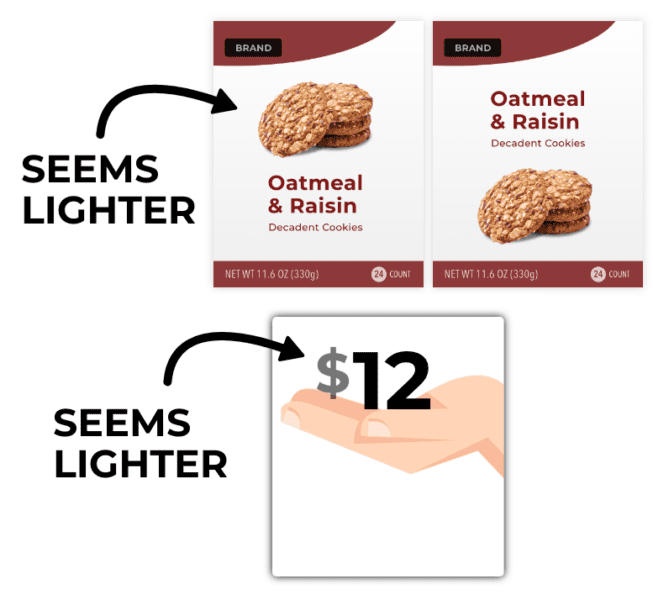
On the same note of position, having the prices at the top makes the prices appear lighter. This is the same principle with having food higher at the top of packages. In the case of oatmeal cookies that appear at the top, makes them seem like diet cookies. Diet cookies are lighter than regular cookies.
Also, make little to no space between plans. Secondly, make the plans within the same height. Both these make the intrinsic differences easier to notice, and hence comparing is easier.
10. Don’t Show the Discounted Price
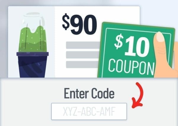
You may be familiar with seeing red strike-through on prices with a bolded discounted price nearby. Actually, what this does is cause the shopper to look around for a price lower than that discounted price. This is the reason why giving coupons is more effective than displaying discounts. This allows shoppers to imagine the price reduction which makes them feel good. Also in regards to timing, wait until checkout for customers to see the price reduction if they are aware of the discount.
11. Use Visual Cues Associated With Discounts
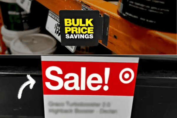
Discounts should look like such. Signs, banners, bold fonts, and vibrant colours—can boost sales even when no actual discount is being offered. Customers are often drawn to these cues because they associate them with savings, which can energise them and increase their likelihood of purchasing.
For example, placing “Everyday Low Price” signs in front of products, even without lowering prices, can double sales. The visual cues (such as exclamation points, large fonts, or red backgrounds) can enhance the perception of a discount, making customers feel more excited and motivated to act.
However, excessive use of these cues can backfire in certain contexts, like high-ticket or B2B items, where too much flair might lower the perceived value.
Free Download – Category Management Guide
Are You Concerned That You Are Using the Same Promotional Mechanics That You Did Last Year and You Still Have No Idea if They Make Money?
Discover how to design more effective promotional plans that are profitable with a known ROI. This guide looks at how more effective promotional planning can be applied in today’s UK Supermarkets. It will provide you with new approaches, fresh thinking and thought provocation to ensure you keep ahead of your competitors. With 7 pragmatic tips, you can take away and use today.
Click the image below to open:
Sources of Research
The research used to identify these shopper insights were:
- Thomas and Morwitz 2005
- Coulter, Choi and Monroe 2012
- Hossain and Morgan 2006
- Coulter 2002
- Coukter 2005
- Wadhwa and Zhang 2005
- Janiszewski and Uy 2008
- Dehaene 1992
- Adaval and Monroe 2002
- Meier and Robinson 2004
- Dehaene, Bossini, and Giraux 1991

